Slopmuks
Commit info
Committed 2026-11-22 at 14:15:58 UTC by @hexa:lossy.network
Description
Inspired by https://slopstrap.mikelacher.com/
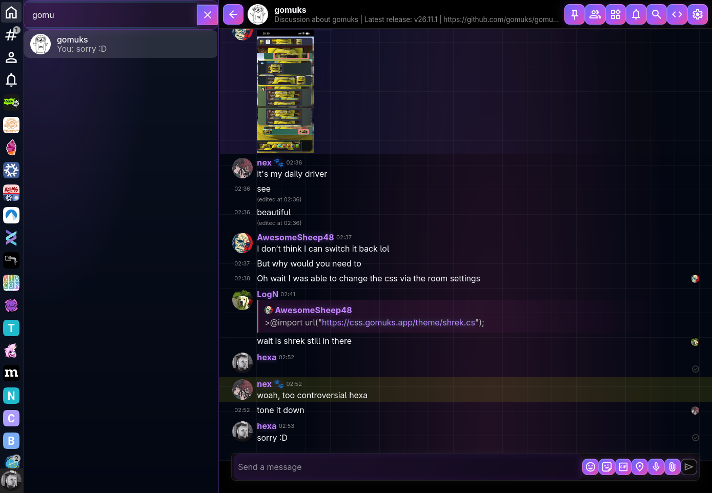
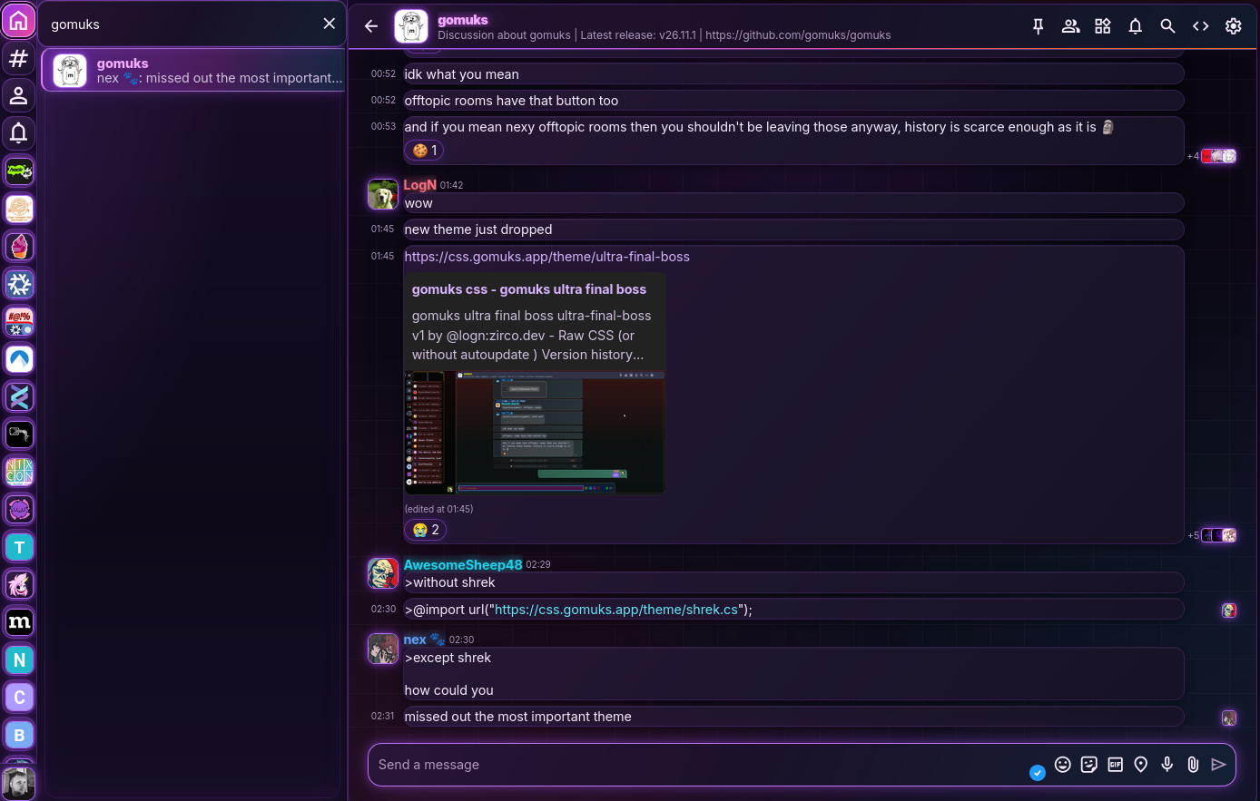
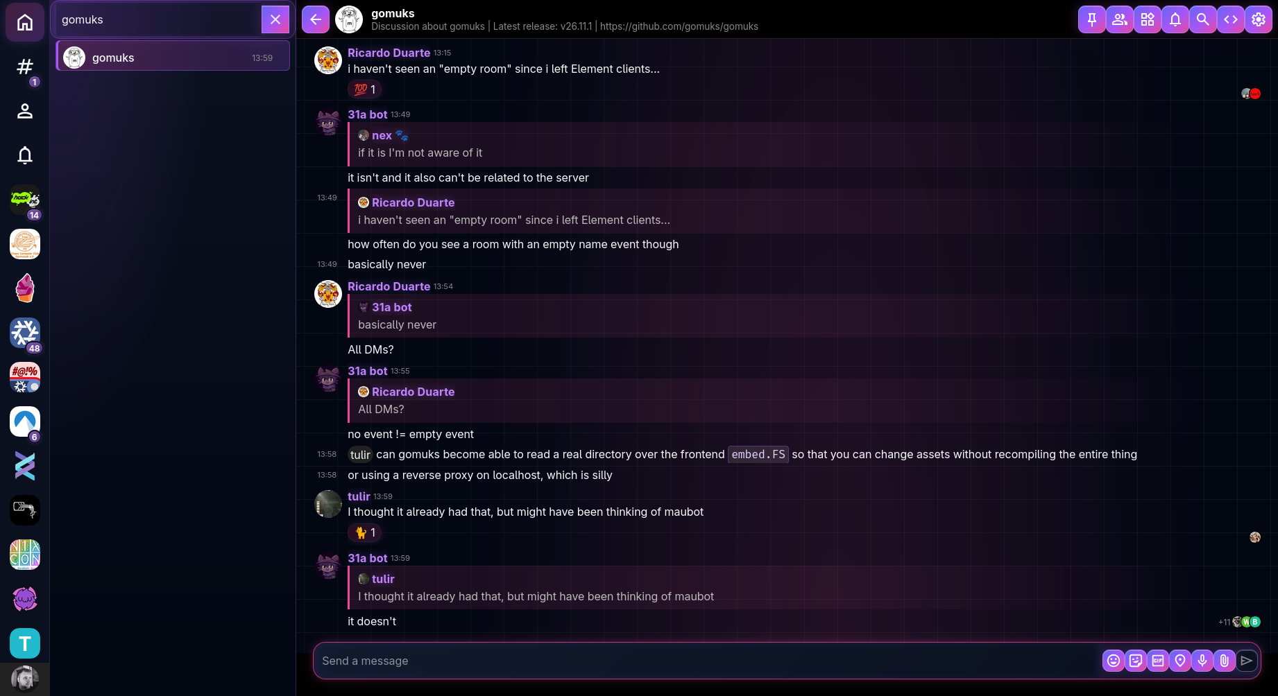
Previews
Code
To use this theme, paste the following import at the top of your custom CSS.
Optionally, you can replace https://css.gomuks.app with _gomuks to proxy the request
through the gomuks backend with caching. When using a specific commit, the backend caches the CSS forever and
will never re-request from upstream.
@import url("https://css.gomuks.app/theme/slopmuks/commit/3.css");Full CSS
/*
 * SLOPMUKS
 * Slopstrap-inspired gomuks theme
 */

/* ==========================================================================
   1. PALETTE & THEME VARIABLES
   ========================================================================== */

:root {
  --slop-bg: #030712;
  --slop-bg-elevated: #0b1120;

  --slop-surface: rgba(15, 23, 42, .68);
  --slop-surface-hover: rgba(30, 41, 59, .78);

  --slop-purple: #a855f7;
  --slop-violet: #8b5cf6;
  --slop-indigo: #6366f1;
  --slop-pink: #ec4899;
  --slop-cyan: #06b6d4;

  --slop-text: #f8fafc;
  --slop-text-muted: #94a3b8;

  --slop-gradient:
    linear-gradient(135deg, #6366f1 0%, #a855f7 50%, #06b6d4 100%);

  --slop-gradient-hot:
    linear-gradient(135deg, #ec4899 0%, #a855f7 50%, #6366f1 100%);

  --slop-glow:
    0 0 12px rgba(168, 85, 247, .35),
    0 0 30px rgba(99, 102, 241, .18);

  --slop-glow-pink:
    0 0 10px rgba(236, 72, 153, .3),
    0 0 24px rgba(168, 85, 247, .2);

  /* Gomuks theme variables */
  --bg-surface: var(--slop-bg);
  --bg-surface-low: #080d1a;
  --bg-surface-raised: var(--slop-bg-elevated);
  --bg-surface-hover: #1e293b;
  --bg-surface-active: #31204c;
  --bg-surface-high: #151b2d;
  --bg-surface-lowest: #030712;
  --bg-surface-highest: #20243a;

  --bg-accent: var(--slop-purple);
  --bg-accent-hover: var(--slop-violet);
  --bg-accent-active: var(--slop-indigo);

  --bg-positive: #10b981;
  --bg-warning: #f59e0b;
  --bg-critical: #f43f5e;

  --text-normal: var(--slop-text);
  --text-muted: var(--slop-text-muted);
  --text-faint: #64748b;
  --text-on-accent: #ffffff;
  --text-positive: #6ee7b7;
  --text-warning: #fcd34d;
  --text-critical: #fda4af;
  --text-link: #c084fc;

  --border-subtle: rgba(168, 85, 247, .16);
  --border-normal: rgba(168, 85, 247, .35);
  --border-accent: var(--slop-purple);

  --timeline-bg: transparent;
  --timeline-background: transparent;
  --timeline-highlight-bg: rgba(168, 85, 247, .12);
  --timeline-highlight-border: var(--slop-purple);
  --timeline-event-hover-bg: rgba(168, 85, 247, .13);
  --timeline-own-event-bg: rgba(99, 102, 241, .06);
  --timeline-own-event-border: rgba(99, 102, 241, .3);

  --button-bg: linear-gradient(135deg, #6366f1, #a855f7 55%, #ec4899);
  --button-bg-hover: linear-gradient(135deg, #818cf8, #c084fc 55%, #f472b6);
  --button-text: #ffffff;

  --input-bg: #0b1120;
  --input-border: rgba(168, 85, 247, .4);
  --input-border-focus: var(--slop-purple);
}


/* ==========================================================================
   2. GLOBAL APP BACKGROUND
   ========================================================================== */

body {
  color: var(--slop-text);
  background:
    radial-gradient(
      ellipse at 12% 0%,
      rgba(99, 102, 241, .14),
      transparent 38%
    ),
    radial-gradient(
      ellipse at 90% 15%,
      rgba(168, 85, 247, .12),
      transparent 35%
    ),
    var(--slop-bg);
}


/* ==========================================================================
   3. SIDEBAR GRID & SERVER RAIL
   ========================================================================== */

/* Overall sidebar grid */
div.room-list-wrapper {
  grid-template:
    "spacebar search" var(--window-top-margin)
    "spacebar search" 3.5rem
    "spacebar roomlist" 1fr
    "profile roomlist" 3rem
    "blank roomlist" var(--window-bottom-margin)
    / 4.5rem minmax(0, 1fr);

  min-width: 0;
  width: 100%;

  background:
    radial-gradient(
      ellipse at 20% 0%,
      rgba(168, 85, 247, .16),
      transparent 45%
    ),
    linear-gradient(180deg, #0b1120, #030712);

  border-right: 1px solid rgba(168, 85, 247, .3);
  box-shadow: 6px 0 30px rgba(0, 0, 0, .35);
}

/* Solid dark-glass server rail */
div.space-bar {
  box-sizing: border-box;
  width: auto;
  min-width: 0;
  padding-top: var(--window-top-margin);

  display: flex;
  flex-direction: column;
  align-items: center;

  background: rgba(11, 17, 32, .96);
  backdrop-filter: blur(18px);
  -webkit-backdrop-filter: blur(18px);

  border-right: 1px solid rgba(139, 92, 246, .18);
  box-shadow: inset -1px 0 0 rgba(255, 255, 255, .025);

  overflow-x: hidden;
  overflow-y: auto;
}

/* Space tiles */
div.space-bar > div.space-entry {
  position: relative;
  box-sizing: border-box;
  flex: 0 0 56px;

  width: 56px;
  height: 56px;
  padding: 6px;
  margin: 4px 0;

  display: flex;
  align-items: center;
  justify-content: center;

  border-radius: 16px;
  transition:
    border-radius .18s ease,
    background .18s ease,
    box-shadow .18s ease;
}

/* Actual room avatars */
div.space-bar > div.space-entry > img.avatar {
  display: block;
  width: 44px;
  height: 44px;
  max-width: none;
  border-radius: 14px;
  object-fit: cover;
}

/* Fake-space SVG icons */
div.space-bar > div.space-entry > svg {
  width: 32px;
  height: 32px;
}

/* Space hover */
div.space-bar > div.space-entry:hover,
div.space-bar > div.space-entry:focus {
  border-radius: 13px;
  background: rgba(168, 85, 247, .2);
  box-shadow: 0 0 14px rgba(168, 85, 247, .15);
}

/* Active space */
div.space-bar > div.space-entry.active {
  border-radius: 13px;
  background: linear-gradient(
    135deg,
    rgba(236, 72, 153, .24),
    rgba(168, 85, 247, .28)
  );
  box-shadow: 0 0 16px rgba(168, 85, 247, .2);
}


/* ==========================================================================
   4. ROOM LIST & SEARCH
   ========================================================================== */

/* Room list column */
div.room-list {
  min-width: 0;
  width: 100%;
  box-sizing: border-box;
  background: transparent;
  padding-bottom: var(--window-bottom-margin);
}

/* Room search */
div.room-search-wrapper {
  box-sizing: border-box;
  width: 100%;
  padding-inline: 8px;

  background: rgba(168, 85, 247, .07);
  border: 1px solid rgba(168, 85, 247, .42);
  border-radius: 14px;

  box-shadow:
    inset 0 0 14px rgba(168, 85, 247, .06),
    0 0 20px rgba(168, 85, 247, .12);
}

div.room-search-wrapper > input {
  padding-left: 8px;
}

/* Room entries */
div.room-entry {
  --room-list-entry-height: 2.75rem;
  --room-avatar-size: 2rem;
  --room-avatar-margin: .375rem;

  border: 1px solid transparent;
  border-radius: 6px;
  margin: 2px 8px;
  width: calc(100% - 16px);
  box-sizing: border-box;

  transition:
    background .18s ease,
    border-color .18s ease,
    box-shadow .18s ease;
}

div.room-entry:hover {
  transform: none;
  background: rgba(168, 85, 247, .13);
  border-color: rgba(168, 85, 247, .25);
  box-shadow: none;
}

/* Active room */
div.room-entry.active {
  background: linear-gradient(
    90deg,
    rgba(236, 72, 153, .19),
    rgba(168, 85, 247, .2)
  );
  border-color: rgba(168, 85, 247, .45);
  box-shadow: inset 3px 0 var(--slop-purple);
}

/* Profile switcher */
div.profile-switcher {
  display: flex;
  align-items: center;
  justify-content: center;
}

div.profile-switcher > div.profile-switcher-item {
  display: flex;
  align-items: center;
  justify-content: center;
}


/* ==========================================================================
   5. UNREAD BADGES
   Muted violet for ordinary unread, vivid pink for mentions
   ========================================================================== */

/* Shared pill appearance */
.room-entry-unreads > .unread-count {
  display: inline-flex;
  align-items: center;
  justify-content: center;
  box-sizing: border-box;

  min-width: 20px;
  height: 20px;
  padding: 0 6px;

  color: #fff !important;
  background: linear-gradient(135deg, #7955a8, #56377f) !important;
  border: 1px solid rgba(190, 160, 230, .45) !important;
  border-radius: 999px;

  font-family: inherit;
  font-size: 10px;
  font-weight: 900;
  line-height: 1;
  letter-spacing: -.2px;

  box-shadow:
    0 0 5px rgba(130, 85, 180, .25),
    inset 0 1px 2px rgba(255, 255, 255, .12);
}

/* Notifications: brighter violet */
.room-entry-unreads > .unread-count.notified {
  background: linear-gradient(135deg, #9866c7, #7043a5) !important;
  border-color: rgba(205, 170, 245, .6) !important;
}

/* Mentions/highlights: vivid pink */
.room-entry-unreads > .unread-count.highlighted {
  background: linear-gradient(135deg, #ff3b81, #e62965) !important;
  border-color: rgba(255, 160, 195, .75) !important;
  box-shadow:
    0 0 6px rgba(255, 45, 120, .6),
    0 0 15px rgba(236, 72, 153, .4),
    inset 0 1px 2px rgba(255, 255, 255, .2);
}

/* Manually marked unread: subdued purple */
.room-entry-unreads > .unread-count.marked-unread {
  background: linear-gradient(135deg, #7955a8, #56377f) !important;
  border-color: rgba(190, 160, 230, .5) !important;
  box-shadow: 0 0 5px rgba(130, 85, 180, .25);
}

/* Space badge positioning */
div.space-bar > div.space-entry {
  position: relative;
  overflow: visible;
}

div.space-bar > div.space-entry > .room-entry-unreads.floating {
  position: absolute !important;
  top: auto !important;
  right: 12px !important;
  bottom: 12px !important;
  left: auto !important;

  width: auto !important;
  height: auto !important;
  margin: 0 !important;
  padding: 0 !important;

  transform: none !important;
  z-index: 10;
  pointer-events: none;
}

/* Space badge outline */
div.space-bar .room-entry-unreads.floating > .unread-count.space {
  border: 2px solid #0b1120 !important;
  min-width: 20px;
  height: 20px;
}

/* Room-list badges retain normal layout */
div.room-list .room-entry-unreads {
  position: relative;
}


/* ==========================================================================
   6. TIMELINE BACKGROUND
   Ambient gradient mesh + structured 48px grid
   ========================================================================== */

div.timeline-view {
  position: relative;
  isolation: isolate;

  background-color: #030712 !important;
  background-image:
    radial-gradient(
      ellipse at 15% 5%,
      rgba(99, 102, 241, .22),
      transparent 42%
    ),
    radial-gradient(
      ellipse at 88% 28%,
      rgba(168, 85, 247, .19),
      transparent 43%
    ),
    radial-gradient(
      ellipse at 55% 100%,
      rgba(236, 72, 153, .13),
      transparent 48%
    ),
    linear-gradient(
      to right,
      rgba(148, 163, 184, .065) 1px,
      transparent 1px
    ),
    linear-gradient(
      to bottom,
      rgba(148, 163, 184, .065) 1px,
      transparent 1px
    ) !important;

  background-size:
    auto,
    auto,
    auto,
    48px 48px,
    48px 48px !important;

  background-position: center, center, center, center, center;
  background-attachment: local;
}


/* ==========================================================================
   7. MESSAGE EVENTS & TYPOGRAPHY
   ========================================================================== */

div.timeline-event,
div.timeline-event.same-sender {
  background-color: transparent;
  border-left: 2px solid transparent;

  transition:
    background .16s ease,
    border-color .16s ease;
}

div.timeline-event:hover {
  background: linear-gradient(
    90deg,
    rgba(168, 85, 247, .13),
    rgba(99, 102, 241, .07),
    transparent 85%
  );
  border-left-color: var(--slop-purple);
}

div.timeline-event .event-sender {
  color: #c084fc;
  text-shadow: 0 0 12px rgba(168, 85, 247, .4);
  font-weight: 800;
  letter-spacing: .015em;
}

div.timeline-event .event-content {
  color: var(--slop-text);
  line-height: 1.55;
}

div.timeline-event a,
div.timeline-event .event-content a {
  color: #c084fc;
  text-decoration: none;
  transition: color .2s ease, text-shadow .2s ease;
}

div.timeline-event a:hover,
div.timeline-event .event-content a:hover {
  color: #38bdf8;
  text-shadow: 0 0 12px rgba(6, 182, 212, .55);
}

div.timeline-event code {
  color: #e9d5ff;
  background: rgba(168, 85, 247, .14);
  border: 1px solid rgba(168, 85, 247, .35);
  border-radius: 5px;
  padding: 2px 5px;
}

div.timeline-event pre {
  background: #0b1120;
  border: 1px solid rgba(168, 85, 247, .45);
  border-radius: 10px;

  box-shadow:
    inset 0 0 20px rgba(99, 102, 241, .08),
    0 0 14px rgba(168, 85, 247, .12);
}

div.timeline-event blockquote {
  border-left: 3px solid var(--slop-pink);
  background: linear-gradient(
    90deg,
    rgba(236, 72, 153, .12),
    transparent
  );
  padding: 7px 12px;
  border-radius: 0 8px 8px 0;
}


/* ==========================================================================
   8. DATE SEPARATORS
   ========================================================================== */

div.date-separator {
  color: #c4b5fd;
  text-shadow: 0 0 12px rgba(168, 85, 247, .45);
  border-color: rgba(168, 85, 247, .4);
}

div.date-separator::before,
div.date-separator::after {
  border-color: rgba(168, 85, 247, .48);
  box-shadow: 0 0 9px rgba(168, 85, 247, .2);
}


/* ==========================================================================
   9. REACTIONS
   ========================================================================== */

div.event-reactions {
  gap: 5px;
}

div.event-reactions > * {
  background: linear-gradient(
    135deg,
    rgba(236, 72, 153, .18),
    rgba(168, 85, 247, .2)
  );
  border: 1px solid rgba(168, 85, 247, .5);
  border-radius: 999px;
  box-shadow: 0 0 12px rgba(168, 85, 247, .16);
  transition: all .16s ease;
}

div.event-reactions > *:hover {
  background: linear-gradient(135deg, #ec4899, #a855f7);
  border-color: #f0abfc;
  box-shadow: 0 0 18px rgba(236, 72, 153, .4);
  transform: translateY(-2px);
}


/* ==========================================================================
   10. COMPOSER & INPUTS
   ========================================================================== */

div.room-view textarea,
div.room-view input {
  color: var(--slop-text);
  background: linear-gradient(135deg, #111a2e, #0b1120);
  border: 1px solid rgba(168, 85, 247, .45);
  border-radius: 13px;

  box-shadow:
    inset 0 0 16px rgba(99, 102, 241, .1),
    0 0 13px rgba(168, 85, 247, .12);

  transition: border-color .18s ease, box-shadow .18s ease;
}

div.room-view textarea:focus,
div.room-view input:focus {
  border-color: var(--slop-purple);
  outline: none;

  box-shadow:
    inset 0 0 16px rgba(168, 85, 247, .1),
    var(--slop-glow);
}

/* Pink neon composer frame */
div.room-view div.message-composer {
  border: 1px solid rgba(236, 72, 153, .75);
  border-radius: 18px;
  background: linear-gradient(135deg, #1b1028, #0b1120);
  box-shadow:
    inset 0 0 16px rgba(168, 85, 247, .08),
    0 0 10px rgba(236, 72, 153, .2),
    0 0 24px rgba(236, 72, 153, .1);
  overflow: hidden;
}

div.room-view div.message-composer:focus-within {
  border-color: #f472b6;
  box-shadow:
    inset 0 0 16px rgba(168, 85, 247, .1),
    0 0 12px rgba(236, 72, 153, .4),
    0 0 28px rgba(236, 72, 153, .2),
    0 0 38px rgba(168, 85, 247, .12);
}


/* ==========================================================================
   11. BUTTONS
   ========================================================================== */

button {
  color: #fff;
  background: linear-gradient(
    135deg,
    #6366f1,
    #a855f7 55%,
    #ec4899
  );
  border: 1px solid rgba(216, 180, 254, .4);
  border-radius: 10px;

  box-shadow:
    0 0 18px rgba(168, 85, 247, .28),
    inset 0 1px rgba(255, 255, 255, .22);

  transition: all .16s ease;
}

button:hover {
  filter: brightness(1.16) saturate(1.15);
  box-shadow:
    0 0 24px rgba(168, 85, 247, .48),
    0 0 42px rgba(236, 72, 153, .16),
    inset 0 1px rgba(255, 255, 255, .3);
  transform: translateY(-1px);
}

button:active {
  transform: translateY(1px) scale(.98);
}


/* ==========================================================================
   12. MODALS
   ========================================================================== */

div.modal-box-inner {
  background:
    radial-gradient(
      ellipse at top left,
      rgba(236, 72, 153, .13),
      transparent 55%
    ),
    linear-gradient(145deg, #151b2d, #080d1a);

  border: 1px solid rgba(168, 85, 247, .5);
  border-radius: 18px;

  box-shadow:
    0 0 25px rgba(168, 85, 247, .2),
    0 0 70px rgba(99, 102, 241, .16),
    0 24px 70px rgba(0, 0, 0, .65);
}


/* ==========================================================================
   13. SELECTION, SCROLLBARS & FOCUS
   ========================================================================== */

::selection {
  color: #fff;
  background: var(--slop-purple);
}

* {
  scrollbar-color: var(--slop-violet) #0b1120;
}

*::-webkit-scrollbar {
  width: 10px;
  height: 10px;
}

*::-webkit-scrollbar-track {
  background: #0b1120;
}

*::-webkit-scrollbar-thumb {
  background: linear-gradient(
    180deg,
    #6366f1,
    #a855f7,
    #ec4899
  );
  border: 2px solid #0b1120;
  border-radius: 999px;
  box-shadow: 0 0 10px rgba(168, 85, 247, .3);
}

hr {
  border: 0;
  border-top: 1px solid rgba(168, 85, 247, .35);
  box-shadow: 0 0 8px rgba(168, 85, 247, .2);
}

:focus-visible {
  outline: 2px solid var(--slop-purple);
  outline-offset: 3px;
  box-shadow: 0 0 12px rgba(168, 85, 247, .4);
}

/* ==========================================================================
   14. SIDEBAR REFINEMENTS
   ========================================================================== */

/* Single-line room entries without message previews */
div.room-list > div.room-entry {
  grid-template:
    "avatar name timestamp unreads" 1fr
    / auto minmax(0, 1fr) auto auto;
  align-items: center;
}

/* Room name */
div.room-list > div.room-entry > div.room-name {
  grid-area: name;
  grid-row: 1;
  align-self: center;
  min-width: 0;
  overflow: hidden;
  text-overflow: ellipsis;
  white-space: nowrap;
}

/* Timestamp */
div.room-list > div.room-entry > div.room-entry-timestamp {
  grid-area: timestamp;
  grid-row: 1;
  align-self: center;
  display: block;
  margin-right: .5rem;
}

/* Unread count */
div.room-list > div.room-entry > div.room-entry-unreads {
  grid-area: unreads;
  grid-row: 1;
  align-self: center;
}

/* Hide message previews */
div.room-list > div.room-entry > div.message-preview {
  display: none !important;
}

/* Emphasize unread room names */
div.room-list > div.room-entry.has-unreads > div.room-name {
  font-weight: 700;
}
Comments
No comments yet.