Matte Black
Commit info
Committed at 2026-03-02 22:03:33.505438 +0000 +0000 by @s1lv3r:wolfgirl.pet
Description
Dark theme, a bit of a mashup of various themes + custom changes
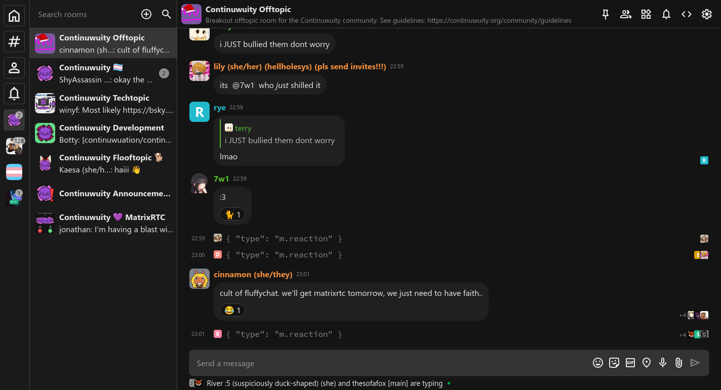
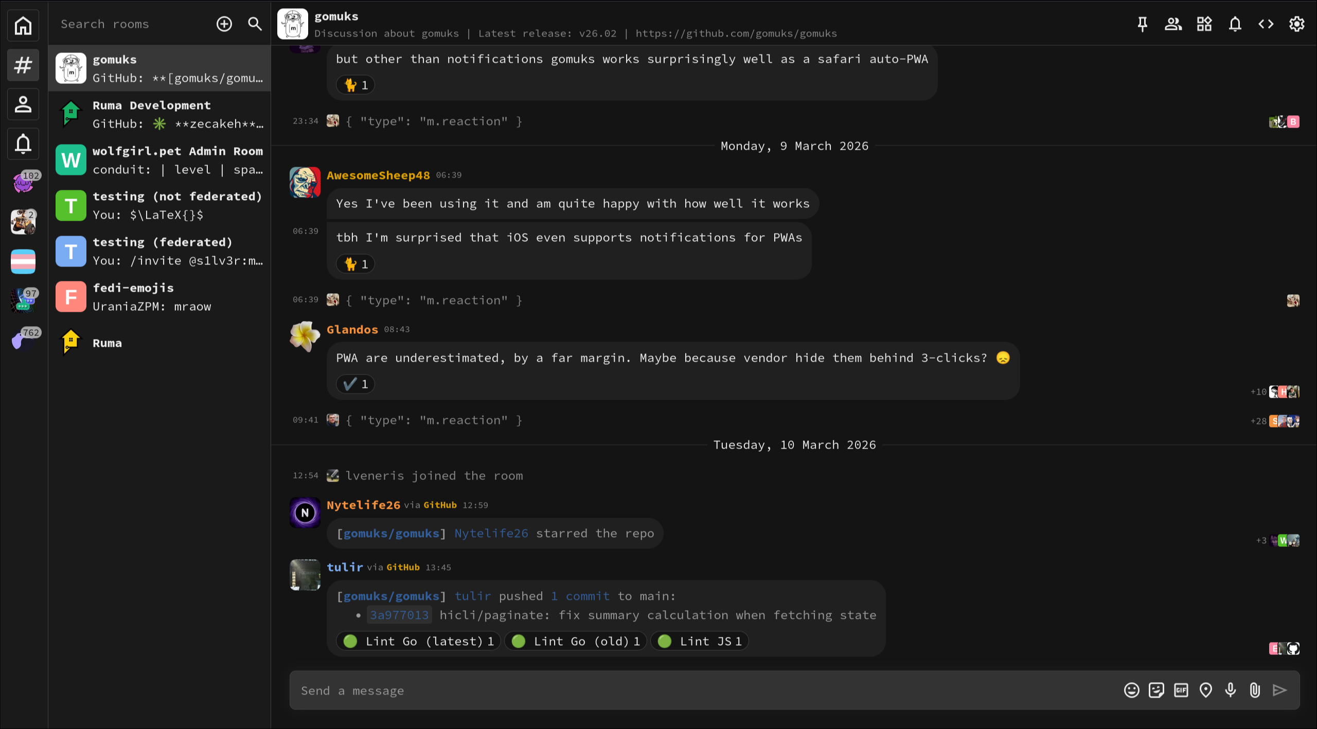
Previews
Code
To use this theme, paste this into your custom CSS:
@import url("https://css.gomuks.app/theme/matteblack.css");Full CSS:
@media (min-width: 721px) {
  button.back {
    display: none;
  }
}

:root {
  --background-color: #141414;
  --timeline-hover-bg-color: #171717;

  --message-bubble-background-color: #202020;

  --text-color: #ebebeb;
  --border-color: #404040;
  --space-list-background-overlay: #1a1a1a;
  --room-list-background-overlay: #1a1a1a;

  --timeline-vertical-padding: 0.25rem;
  --composer-background-color: #333;
  --timeline-message-gap-same-sender: 0;
  --monospace-font-stack: "SauceCodePro NFM";
  --timeline-sender-name-content-gap: 0.3rem;

  --timeline-highlight-bg-color: #3312;
  --timeline-highlight-hover-bg-color: #3315;
}

img.avatar {
  border-radius: 20%;
}

div.room-list-wrapper {
  grid-template:
    "spacebar search" var(--window-top-margin)
    "spacebar roomlist" 3.5rem
    "spacebar roomlist" 1fr /
    3rem 1fr;
  grid-template-rows: 3.5rem 2fr;
  grid-template-columns: 3.9rem 1fr;
}

div.room-search-wrapper {
  height: unset;
}

div.room-list-wrapper,
div.space-bar {
  border-right: 1px solid var(--border-color);
}

div.room-header,
div.room-search-wrapper {
  border-bottom: 1px solid var(--border-color);
}

div.space-entry,
div.message-composer {
  border: 1px solid var(--border-color);
  padding: 0.35rem;
}

div.room-entry {
  width: unset;
  padding: 0.35rem;
}

div.space-entry {
  margin: 0.6rem !important;
}

div.space-entry[data-target-space] {
  border: 1px solid transparent;
}

.html-body {
  table {
    border-collapse: collapse;
    display: table;
    border-spacing: 0;
  }

  table th {
    border: 2px solid var(--border-color);
  }

  table tr {
    background-color: var(--timeline-hover-bg-color);
  }

  table tr:nth-child(2n) {
    background-color: var(--background-color);
  }

  table td {
    padding: 0.5rem;
    border: 1px solid var(--border-color);
  }
}

/*
 * Bubble messages
 */
.timeline-event.small-event {
  color: #888;
}
.timeline-event:not(.small-event) .event-content {
  width: 90%;
  max-width: max-content;
  padding: 0.5rem 0.75rem;
  background: var(--message-bubble-background-color);
  border-radius: 1.25rem;
}
.timeline-event .event-content .event-reactions {
  margin-bottom: 0;
  margin-top: 0.6rem;
}
.timeline-event:not(.small-event) {
  padding-top: 2px;
  padding-bottom: 2px;
}
.timeline-event.same-sender.timeline-event:not(.small-event)
  .event-content {
  border-top-left-radius: 0;
}
.timeline-event.timeline-event:not(.small-event):has(
    + .same-sender
  )
  .event-content {
  border-bottom-left-radius: 0;
}
.timeline-event .event-sender-and-time .event-time {
  margin-left: 0.2rem;
  margin-right: 0.3rem;
}

/* Code blocks */
.timeline-event .event-content .message-text pre {
  padding-top: 0.3rem;
  margin-top: 0.6rem !important;
  margin-bottom: 0.6rem !important;
}

/* Always show member ID */
.member-list .member {
  grid-template: "avatar  displayname" 1.75rem "avatar  userid" 1.25rem / 2.5rem 1fr !important;
  div.displayname {
    align-self: end !important;
  }
  div.user-id {
    display: block !important;
    align-self: start;
  }
}

/* Typing notification padding */
.room-view .typing-notifications {
  margin-top: 2px;
  margin-bottom: 2px;
}