We have Cinny at the mall
Commit info
Committed at 2026-04-22 20:52:38.485761 +0000 +0000 by @igerman:igerman.cc
Description
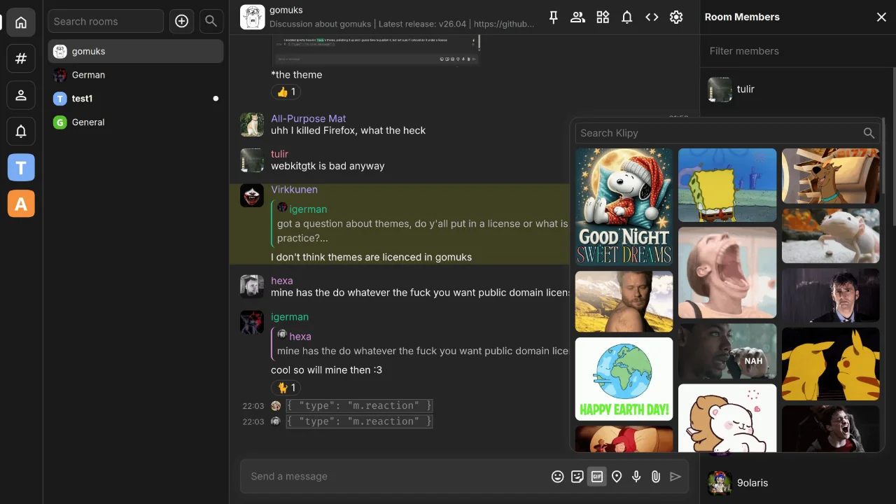
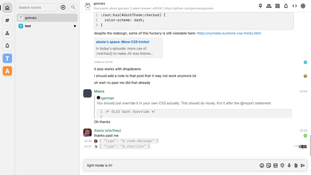
A more thoroughly polished Cinny-style theme. Based on cinny_at_home v3 by [@hexa:lossy.network]. I am terrible at CSS, tried my best to style, not hack. Hopefully it keeps working for a while. Also check that GIF picker! I don't use gomuks frequently, but it was fun to mess around with some CSS. I'll probably not update this frequently, which is why: License: WTFPL
Previews

Code
To use this theme, paste this into your custom CSS:
@import url("https://css.gomuks.app/theme/cinny_at_mall.css");Full CSS:
/*
cinny_at_mall by igerman

A more thoroughly polished Cinny-style theme.
Warning: Loads a font from fonts.googleapis.com.

Modified from: https://css.gomuks.app/theme/cinny_at_home.css
*/
@import url('https://fonts.googleapis.com/css2?family=Inter:ital,opsz,wght@0,14..32,100..900;1,14..32,100..900&display=swap');

:root {
    overscroll-behavior: none;

    --background-color: #262626;
    --border-color: #404040;
    --space-list-background-overlay: #1A1A1A;
    --room-list-background-overlay: #1A1A1A;
    --timeline-hover-bg-color: #333;
    --composer-background-color: #333;
    --timeline-avatar-size: 2.4rem;
    --timeline-horizontal-padding: 1.06667rem;
    --timeline-message-gap: 1.06667rem;
    --highlight-pill-background-color: #175C3F;
    --timeline-hover-bg-color: transparent;
    --timeline-avatar-gap: 0.75rem;
    --timeline-jump-bg-color: #413C65;
    --timeline-jump-hover-bg-color: #494370;
    --font-stack: "Inter", -apple-system, BlinkMacSystemFont, "Segoe UI", Roboto, Helvetica, Arial, sans-serif;
    --text-color: rgb(242, 242, 242);
    --pill-background-color: #175C3F;

    --theme-line-height: 1.46667rem; /* 22px */
}

html {
    /* 15px / 16px. Browsers should have 16px, Cinny is 15px. */
    /* I was relying on pixels, but later converted to REM for supporting browser/accessibility font size overrides */
    font-size: calc(100% * (15 / 16));
}

body {
    line-height: var(--theme-line-height);
}

hr {
    box-sizing: border-box !important;
}

button:not([disabled]) {
    cursor: var(--clickable-cursor) !important;
    /*
    border-radius: 0.53333rem !important;
    border: 0.06667rem solid var(--border-color) !important;
    */
}

div.room-view {
    grid-template: "header" 3.5rem "messageview" 1fr "autocomplete" 0 "typing" auto "input" auto / 1fr;
    height: auto;
}

div.room-list-wrapper {
    grid-template-columns: 4.33333rem 1fr;
    border-right: 0.06667rem solid var(--border-color);
}

div.right-panel {
    background: var(--room-list-background-overlay);
}

.context-menu-container {
    grid-area: empty !important;
}

@media (min-width: 721px) {
    button.back {
        display: none;
    }
}

div.room-header {
    border-bottom: 0.06667rem solid var(--border-color);
    padding: 1.06667rem;
}

.room-header div.right-buttons {
    margin-right: unset !important;
}

div.space-bar {
    width: 4.33333rem !important;
    display: flex;
    flex-direction: column;
    gap: 0.75rem !important;
    align-items: center;
    padding-top: 0.8rem !important;
    z-index: 1;
    border-right: 0.06667rem solid var(--border-color);
}

div.space-entry {
    border: 0.06667rem solid var(--border-color);
    border-radius: 0.66667rem !important;
    width: 2.8rem !important;
    height: 2.8rem !important;
    min-height: 2.8rem;
    padding: 0 !important;
    display: flex;
    justify-content: center;
    align-items: center;
    margin: 0 !important;
    cursor: var(--clickable-cursor) !important;
    transition: margin-left 0.1s ease;
}

div.space-entry::before {
    content: "";
    position: absolute;
    left: -0.13333rem;
    width: 0.33333rem;
    height: 1.2rem;
    border-radius: 0 .25rem .25rem 0;
    background: white;
    opacity: 0;
    transform: translateX(-0.66667rem);
    transition: height .2s linear, transform 0.1s ease-in-out, opacity 0.1s ease;
}

div.space-entry:hover {
    margin-left: 0.26667rem !important;
}

div.space-entry:hover::before {
    opacity: 1;
    transform: translateX(0);
}

div.space-entry.active::before {
    opacity: 1;
    height: 1.6rem;
    transform: translateX(0);
}

div.space-entry.active:hover::before {
    height: 1.6rem;
    transform: translateX(0.13333rem);
}

div.space-entry svg {
    width: 1.6rem !important;
    height: 1.6rem !important;
}

div.space-entry:has(img) {
    border: 0.06667rem solid transparent;
}

div.space-entry:has(img) > img {
    width: 100% !important;
    height: 100% !important;
}

div.room-search-wrapper {
    height: unset;
}

.room-search-wrapper input {
    background: #252525 !important;
    border-radius: 0.53333rem;
    height: 2.4rem !important;
    border: 0.06667rem solid var(--border-color) !important;
    padding-left: 0.53333rem !important;
    margin-top: 0.8rem;
    margin-left: 0.53333rem;
    margin-right: 0.53333rem;
    width: 0 !important; /* allows resizing */
}

.room-search-wrapper button {
    background: #252525;
    border-radius: 0.53333rem !important;
    border: 0.06667rem solid var(--border-color) !important;
    margin-right: 0.53333rem;
    margin-top: 0.8rem;
}

.room-search-wrapper button[disabled] > * {
    color: var(--secondary-text-color);
}

.room-list {
    padding-top: 0.53333rem;
}

img.reaction-emoji {
    /* emojis fix size to only occupy 1 line height */
    max-width: var(--theme-line-height) !important;
    max-height: var(--theme-line-height) !important;
    object-fit: contain !important;
}

div.room-entry {
    height: 2.4rem;
    max-height: 2.4rem !important;
    width: unset;
    margin-left: 0.53333rem;
    margin-right: 0.53333rem;
    border-radius: 0.53333rem !important;
    padding: 0 !important;
}

.room-entry .room-entry-left {
    width: auto !important;
    height: 100% !important;
    padding-right: 0.26667rem;
    display: flex;
    align-items: center;
    padding-left: 0.53333rem;
}

.room-entry-left img {
    margin: 0 !important;
}

.room-name {
    font-family: "Inter";
    font-size: 0.9rem;
    font-weight: 400 !important;
}

div.room-entry:has(div.room-entry-unreads) .room-name {
    font-weight: 700 !important;
    &::after {
        content: "";
        position: absolute !important;
        right: 0.53333rem !important;
        top: 50% !important;
        transform: translateY(-50%) !important;
        width: 0.53333rem !important;
        height: 0.53333rem !important;
        background-color: var(--text-color) !important;
        border-radius: 50% !important;
    }
}

div.room-entry-unreads {
    display: none;
}

.message-text {
    font-family: "Inter";
    font-weight: 400;
}

.message-preview {
    display: none;
}

.event-sender-and-time {
    display: flex;
    align-items: baseline;
    justify-content: space-between;
    gap: 0.53333rem;
    margin: 0;
    margin-top: -0.13333rem !important;
}

.event-sender {
    font-weight: 400 !important;
}

.event-sender:hover {
    cursor: var(--clickable-cursor) !important;
    text-decoration: underline !important;
}

.big-emoji-body {
    line-height: normal;
}

.same-sender {
    margin-top: 0.53333rem !important;
}

.same-sender .event-time-only {
    opacity: 0 !important;
}

.event-time {
    font-size: 0.8rem !important;
}

.hidden-event, .small-event {
    height: 1.6rem;
    align-items: end;
}

.small-event {
    margin-top: 0 !important;
    .event-content {
        color: var(--secondary-text-color);
    }
}

.hidden-event .sender-avatar, .small-event .sender-avatar {
    height: 100% !important;
}

.event-content {
    margin-top: -0.26667rem;
}

.reply-body {
    cursor: var(--clickable-cursor) !important;
    border-radius: 0.53333rem;
}

.event-content:has(.reply-body) {
    margin-top: 0.26667rem;
}

.event-content .notice-message:has(blockquote) {
    /* link embed */
    max-width: 33.33333rem;
    background: var(--room-list-background-overlay);
    opacity: 1;
    box-shadow: inset 0.26667rem 0 0 0 var(--blockquote-border-color);
    border-radius: 0.53333rem;
    padding: 0.53333rem;
    p {
        color: rgb(200, 200, 200);
    }

    blockquote {
        border: none;
    }

    sub {

    }
}

.event-content:not(:has(.notice-message)) {
    blockquote {
        color: var(--secondary-text-color);
        border-left: 4px solid var(--blockquote-border-color);
    }
}

div.event-hover-menu {
    right: 2.5rem;
}

div.message-composer {
    border: 0.06667rem solid var(--border-color);
    border-radius: 0.53333rem !important;
    margin: 1.06667rem;
}

div.message-composer .input-area textarea {
    field-sizing: content !important;
    align-content: center !important;
    margin: 0.53333rem !important;
    max-height: 50vh;
}

div.typing-notifications {
    min-block-size: 1.6rem;
    margin: 0;
    padding-block: .25rem;
    padding-inline: 1.6rem;
    background-color: var(--background-color);
    width: 100%;
    box-shadow: 0 0 0.5rem var(--background-color);
    bottom: 0;
    position: absolute;

    &.empty {
        display: none;
    }
}

.hidden-event .event-content code {
    background: #323232 !important;
    border: 0.06667rem solid #595959;
    width: unset !important;
}

.chroma {
    background: #323232 !important;
    border: 0.06667rem solid #595959;
    width: unset !important;
    display: block !important;
}

.hicli-matrix-uri-user {
    border-radius: 0.26667rem !important;
    margin-top: 0.26667rem !important;
}

.hicli-matrix-uri-user:hover {
    text-decoration: underline !important;
    cursor: var(--clickable-cursor) !important;
}

.html-body {
    table {
        border-collapse: collapse;
        display: table;
        border-spacing: 0;
    }

    table th {
        border: 0.13333rem solid var(--border-color);
    }

    table tr {
        background-color: var(--timeline-hover-bg-color);
    }

    table tr:nth-child(2n) {
        background-color: var(--background-color);
    }

    table td {
        padding: 0.5rem;
        border: 0.06667rem solid var(--border-color);
    }
}

img.avatar {
    border-radius: 0.53333rem;
    cursor: var(--clickable-cursor) !important;
}

.media-container, .hicli-inline-img {
    cursor: var(--clickable-cursor) !important;
}

.gif-picker {
    overflow-y: auto !important;
    overflow-x: hidden !important;
}

/* sticky search (unfinished)
.gif-search {
    position: sticky !important;
    top: 0.53333rem !important;
    z-index: 1 !important;
    margin-top: 0.53333rem !important;
    background: var(--background-color);
    align-items: unset !important;
}
*/

/* gif picker (mosaic style) */
.gif-list {
    display: block !important;
    columns: 3;
    column-gap: 0.53333rem;
    height: auto;
    max-height: none;
    width: 100%;
    box-sizing: border-box;
    overflow: visible !important;
    padding: 0 0.53333rem 0.53333rem 0.53333rem !important;
    margin: 0;
}

.gif-entry {
    display: block;
    width: 100%;
    height: auto;
    max-height: none;
    break-inside: avoid;
    margin: 0 0 0.53333rem 0;
    padding: 0;
}

.gif-entry img {
    display: block;
    width: 100%;
    height: auto;
    max-height: 16.66667rem;
    object-fit: cover;
    border-radius: 0.53333rem;
    margin: 0;
    padding: 0 !important;
}

.powered-by-footer {
    display: block !important;
    column-span: all;
    width: 100%;
    margin: 0.53333rem 0 0 0 !important;
    text-align: center;
}

.room-avatar {
    width: 1.4rem !important;
    height: 1.4rem !important;
}

.sender-avatar {
    align-self: start !important;
    cursor: var(--clickable-cursor) !important;
    margin-top: 0 !important;
}

.hicli-custom-emoji {
    max-height: 1.4rem !important;
}

div.member {
    margin-top: 0.5em;
    margin-left: 0.5em;
    margin-right: 0.5em;
    border-radius: 0.66667rem !important;
}

.modal-box-inner {
    .timeline-view {
        overflow-y: unset; /* fix double scrollbar */
    }

    /* event context already has good paddings because i put them there :), don't match it */
    :not(.event-context-modal) & {
        /* timeline event container (share, report, etc) looks broken if not excluded */
        *:not(.toggle):not(hr):not(.confirm-message-modal *):not(.timeline-event-container *):not(.json-view *) {
            border-radius: 0.53333rem !important;
            padding: 0.26667rem;
            box-sizing: border-box !important;
        }

        select {
            margin: 0.53333rem;
        }

        button {
            background: var(--space-list-background-overlay);
            border: 0.06667rem solid var(--border-color);
            margin: 0.53333rem;
        }
    }

    .confirm-message-modal .timeline-event-container {
        background: var(--space-list-background-overlay);
        padding: 0.53333rem;
    }
}

.media-upload-modal {
    .meta-value:not(:has(*)):not(:has(input)):not(:has(select)) {
        background: var(--space-list-background-overlay);
        color: grey;
    }

    .meta-value:has(input) {
        margin: 0 !important;
        padding: 0 !important;
    }

    .meta-value input:not([type=checkbox]) {
        background: var(--space-list-background-overlay);
        width: 100%;
        padding: 0.26667rem !important;
    }

    .meta-value select {
        margin: 0 !important;
    }

    label {
        align-content: center
    }
}

.state-button-list {
    button {
        margin: 0 !important;
    }
}

.notification-panel-content .highlight {
    --timeline-highlight-bg-color: transparent;
}